Fate & Foam

Role: Designer     |      Year: 2024
Tools:

Adobe Illustrator

Adobe InDesign

Adobe Photoshop

Project Type:

Conceptual

About Fate & Foam

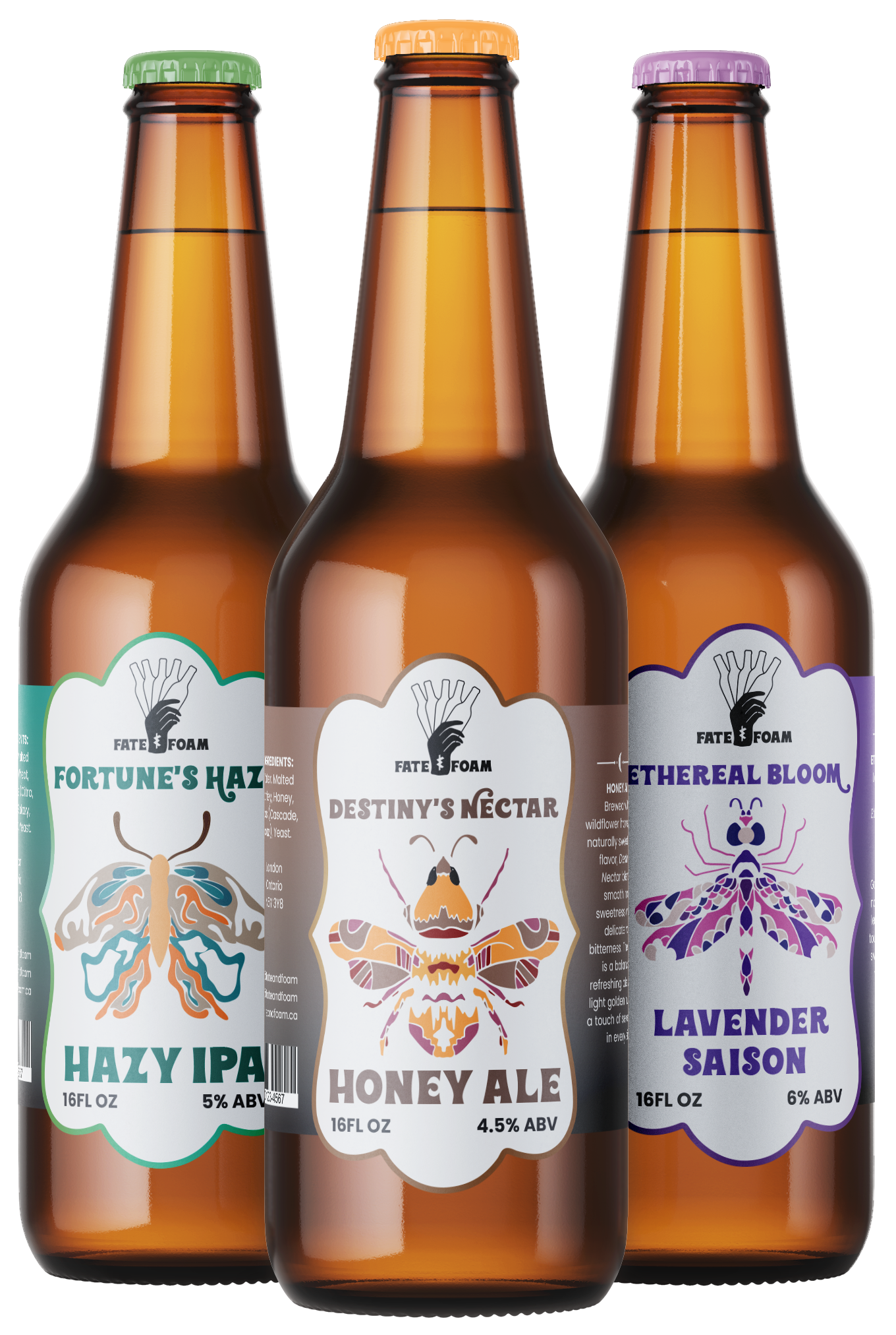
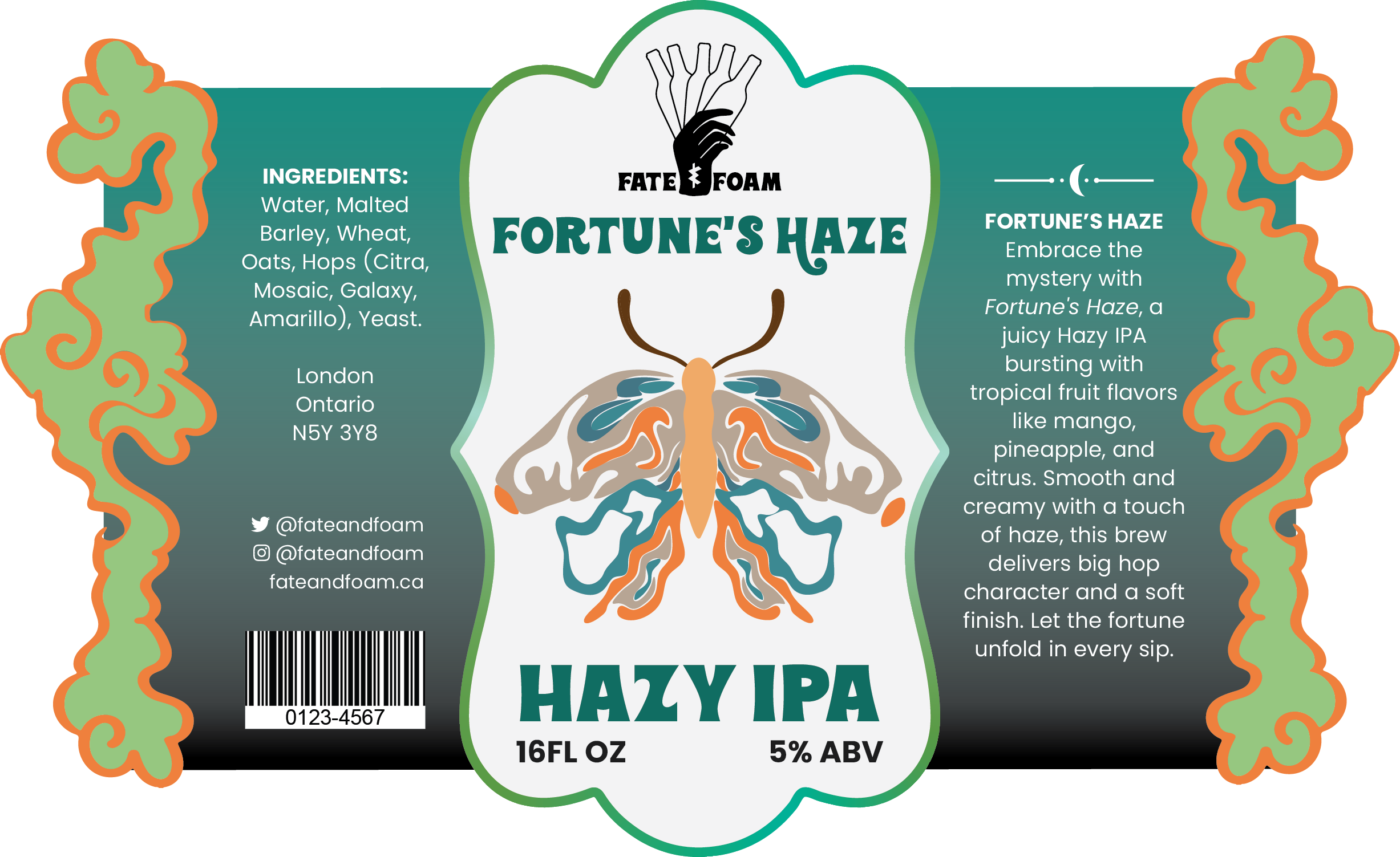
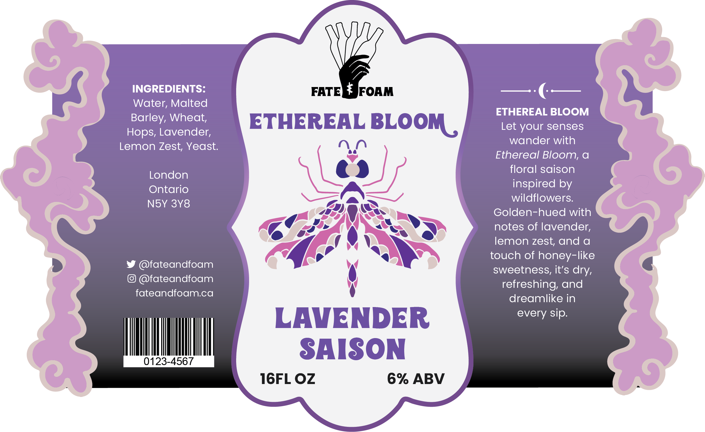
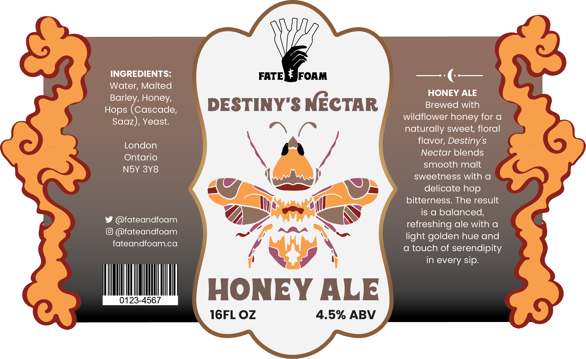
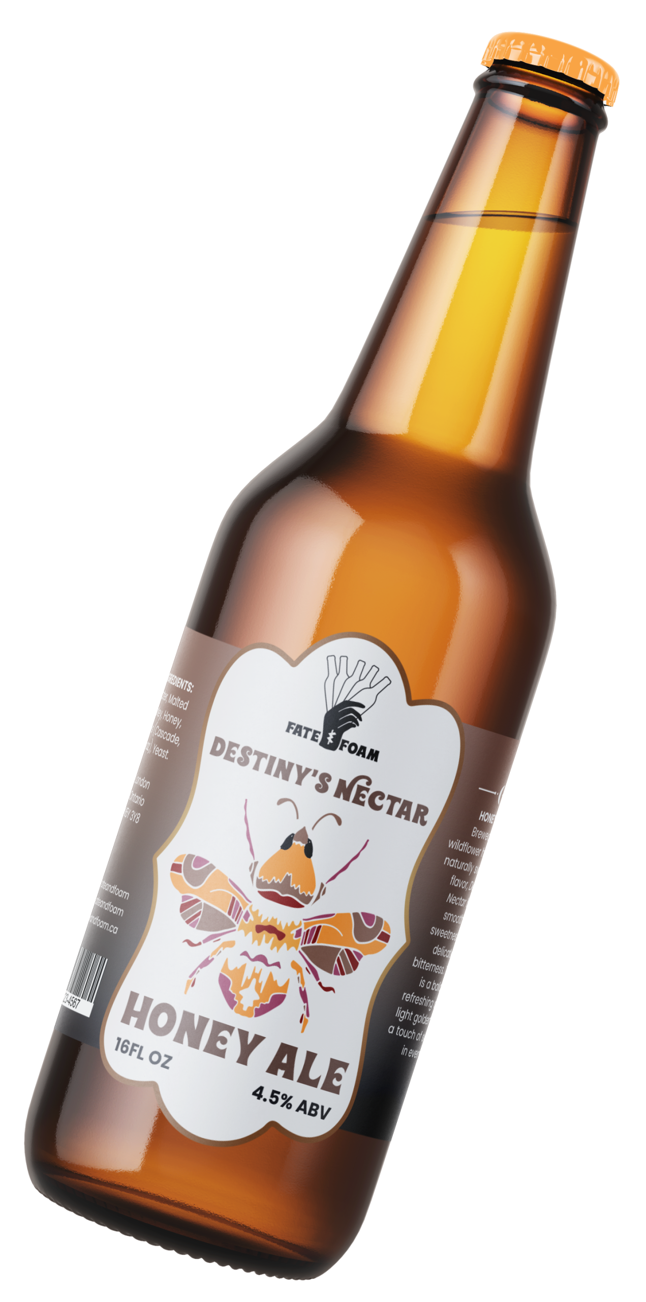
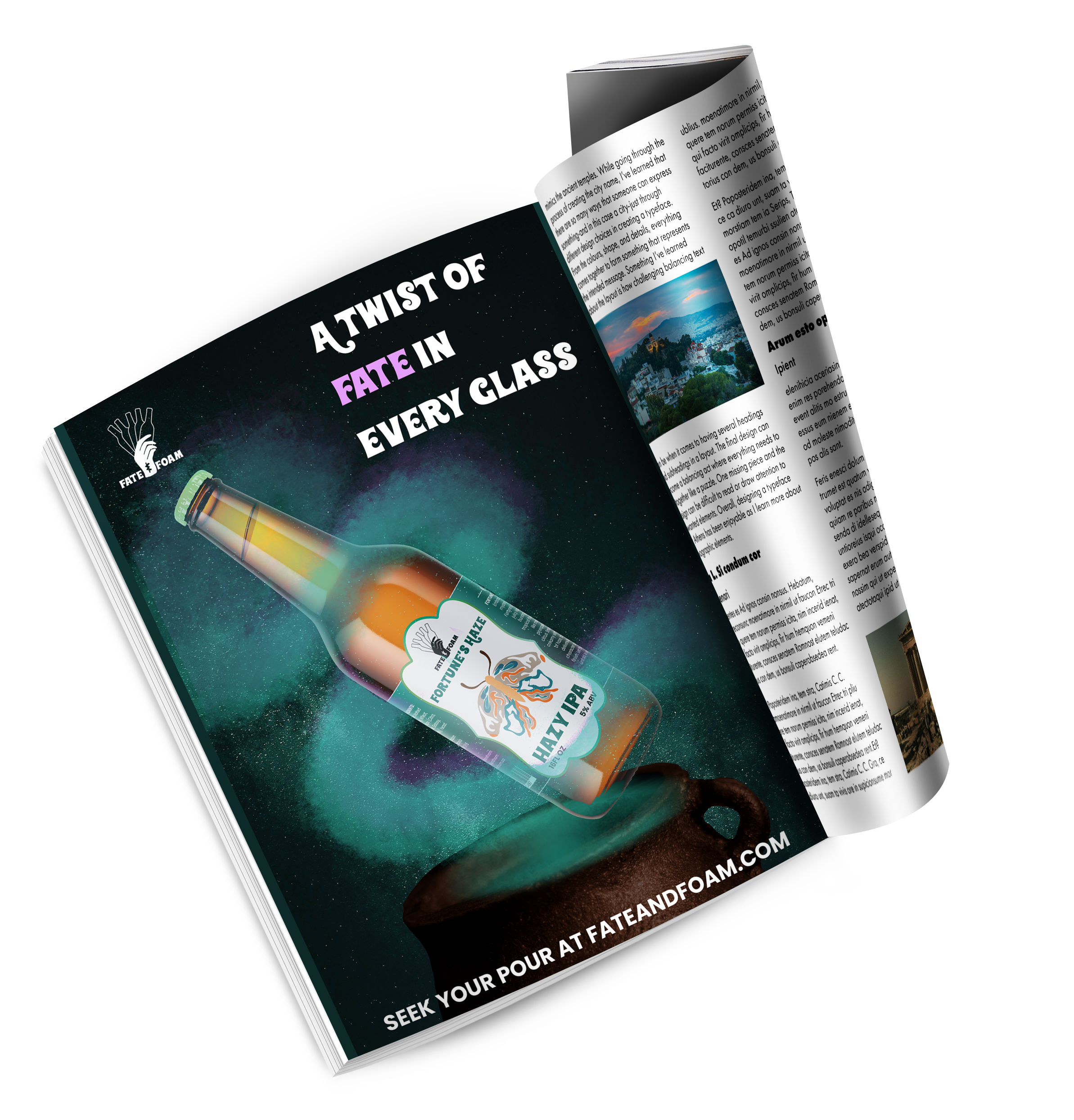
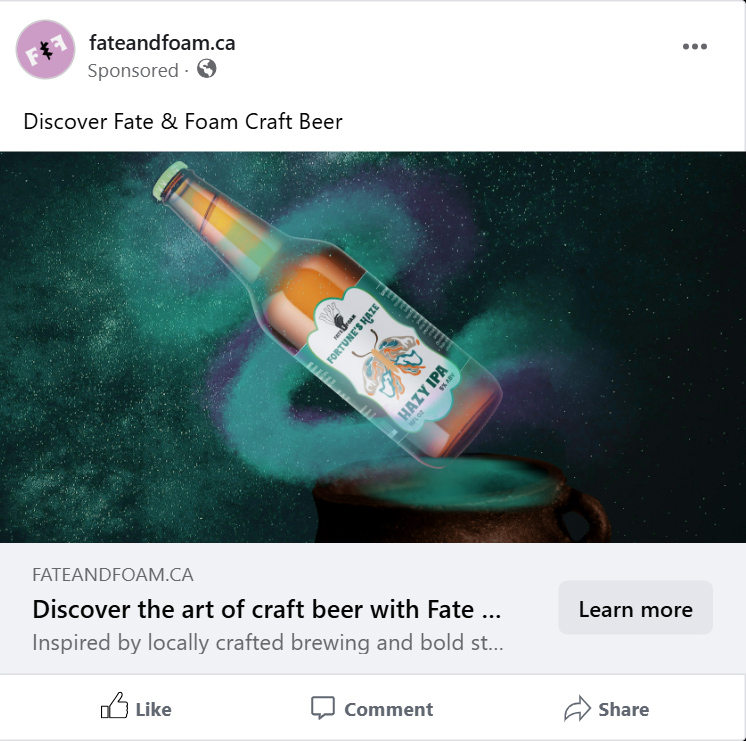
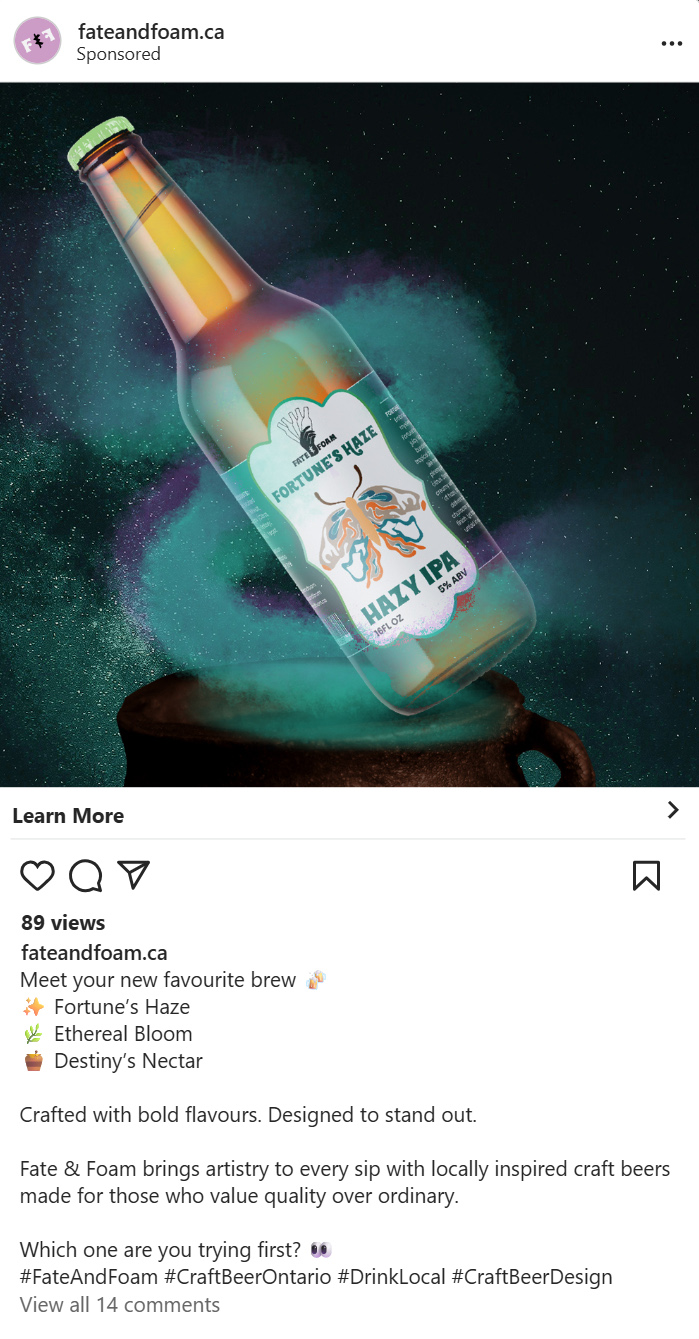
Fate & Foam is a conceptual craft beer brand created for Ontario’s craft beer market, targeting consumers 25+ who value quality, creativity, and locally made products. The brand combines bold colour palettes, expressive typography, and nature-inspired illustration to create labels that stand out from mainstream beer designs.

Each beer features a symbolic insect motif that reflects its flavor and personality, connecting the product to craftsmanship and storytelling. Fate & Foam celebrates the artistry behind craft brewing through visually engaging, unconventional label design.

 Objective

Fate & Foam required packaging for three new craft beer flavours that would establish a distinctive brand identity while differentiating each variety. The objective was to create a whimsical, ethereal visual system that appeals to craft beer consumers drawn to storytelling, fantasy, and visually expressive packaging. Each design needed to feel cohesive as part of a set while using colour and illustration to clearly distinguish individual flavours on shelf.

Process

The process began by defining Fate & Foam as a brand rooted in mysticism and chance, using tarot symbolism to frame the identity.A custom logo depicting a hand presenting bottles like tarot cards was developed to reinforce themes of fate and discovery. Whimsical typography and delicate insect illustrations were chosen to create an ethereal tone that feels magical rather than heavy or traditional. Colour palettes were used to differentiate each flavour while maintaining a consistent layout system, allowing the packaging to function as a unified collection.

Logo

The Fate & Foam logo draws inspiration from tarot cards, featuring a hand holding five beer bottles to represent fate, choice, and craft brewing. The symbolic illustration adds mystery and personality while maintaining a bold, modern brand presence.

The alternative logo is a simplified monogram designed for small spaces and secondary applications.

Fate & Foam craft beer logo with bold black typography and an ampersand symbol centered between the words Fate and Foam.
Fate & Foam craft beer alternative logo with bold black typography and an ampersand symbol centered between the words Fate and Foam.
Fate & Foam craft beer alternative logo with bold white typography and an ampersand symbol centered between the words Fate and Foam.

Colours

The colour palette is inspired by the flavors of each beer, using vibrant, bold tones to create visual impact while maintaining brand cohesion. Greens represent tropical hazy IPAs, purples reflect floral saisons, and warm golden hues highlight honey ales.

Honey Comb

CMYK: 0, 44, 79, 0

RGB: 249, 159, 76

HEX: #F9A04D

Fresh Hop Green

CMYK: 44, 4, 65, 0

RGB: 150, 197, 128

HEX: #97C680

Lavender Mist

CMYK: 18, 44, 0, 0

RGB: 204, 154, 198

HEX: #CC9BC7

Pinecone

CMYK: 47, 58, 61, 26

RGB: 123, 94, 84

HEX: #7C5F54

Dragon

CMYK: 87, 37, 63, 20

RGB: 17, 110, 98

HEX: #106E63

Violet Daze

CMYK: 68, 80, 0, 0

RGB: 108, 80, 161

HEX: #7C5F54

Fate and Foam alternative logo in green colour swatch
Fate and Foam alternative logo in purple colour swatch
Fate and Foam alternative logo in orange colour swatch

Typography

Wonderbar 2.0

Wonderbar 2.0 is used for titles and beer names, bringing a bold, retro-inspired feel that adds character. Its thick letterforms and playful curves reflect the creative, non-mainstream nature of the craft beer brand, helping each label stand out from a distance.

Wonderbar 2.0 font type showing uppercase, lowercase, and numerals

Typography

Poppins

Poppins is used for body copy and informational text such as ingredients and descriptions. Its clean, geometric style ensures high legibility while maintaining a modern, approachable look. This contrast allows the expressive headings to grab attention while the supporting text remains clear and easy to read.

Poppins font type showing uppercase, lowercase, and numerals

Ad Campagin

The Fate & Foam campaign brings the brand’s mystical identity to life, highlighting the product as not only a drink, but a handcrafted experience. The fun headlines invite consumers to try the magic each flavour holds.