Role: Designer | Year: 2024
Tools:
Adobe Illustrator
Adobe InDesign
Adobe Photoshop
Project Type:
Conceptual
About FoxFlare
FoxFlare is a home renovation company that specializes in custom fireplace remodels. The brand combines professional craftsmanship with an approachable, inviting tone to help homeowners create warm, high-quality spaces. Its visual identity features a fox-shaped flame logo and a rich natural color palette, reflecting both expertise and personality. Brochures and marketing materials communicate services clearly and elegantly.
Objective
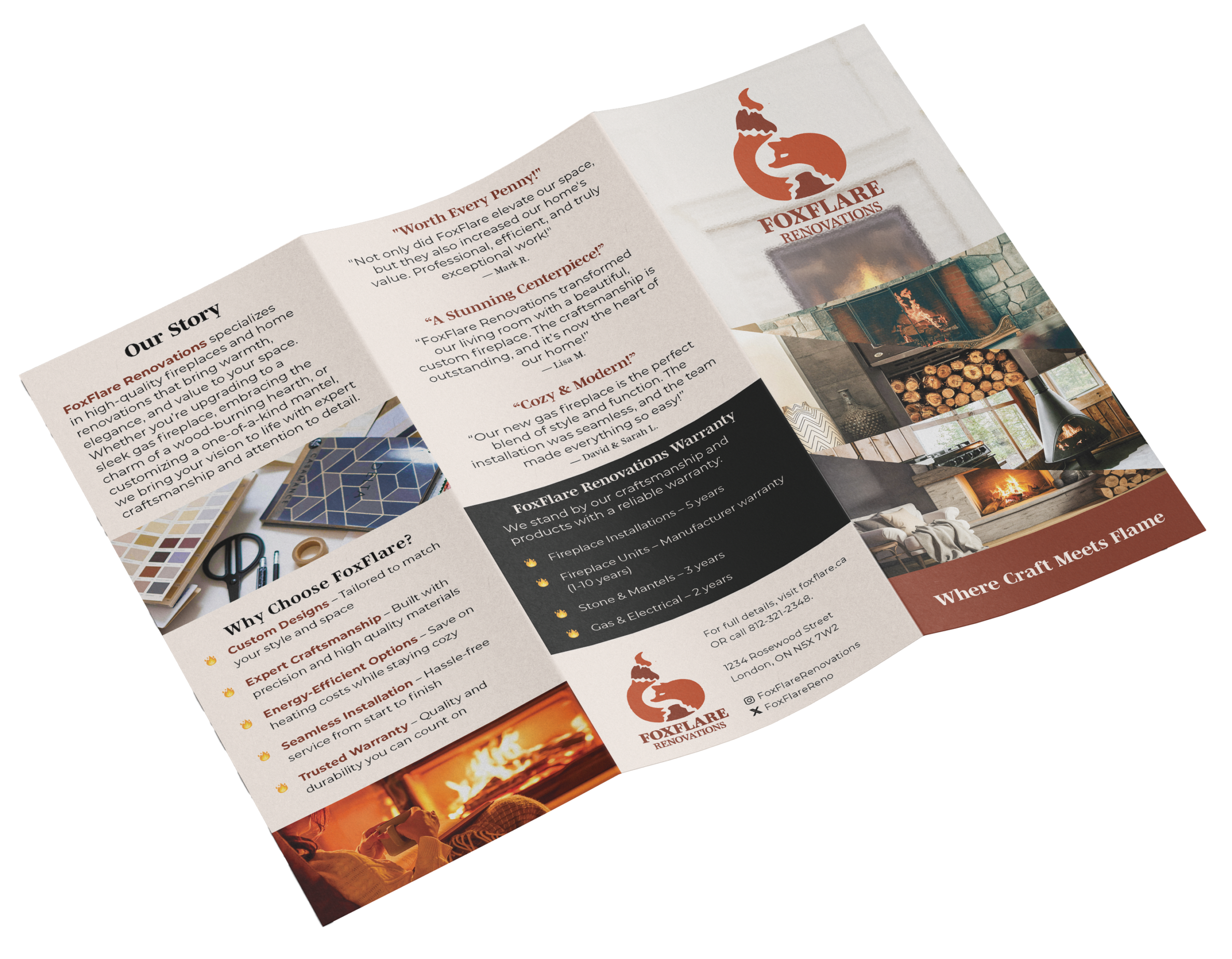
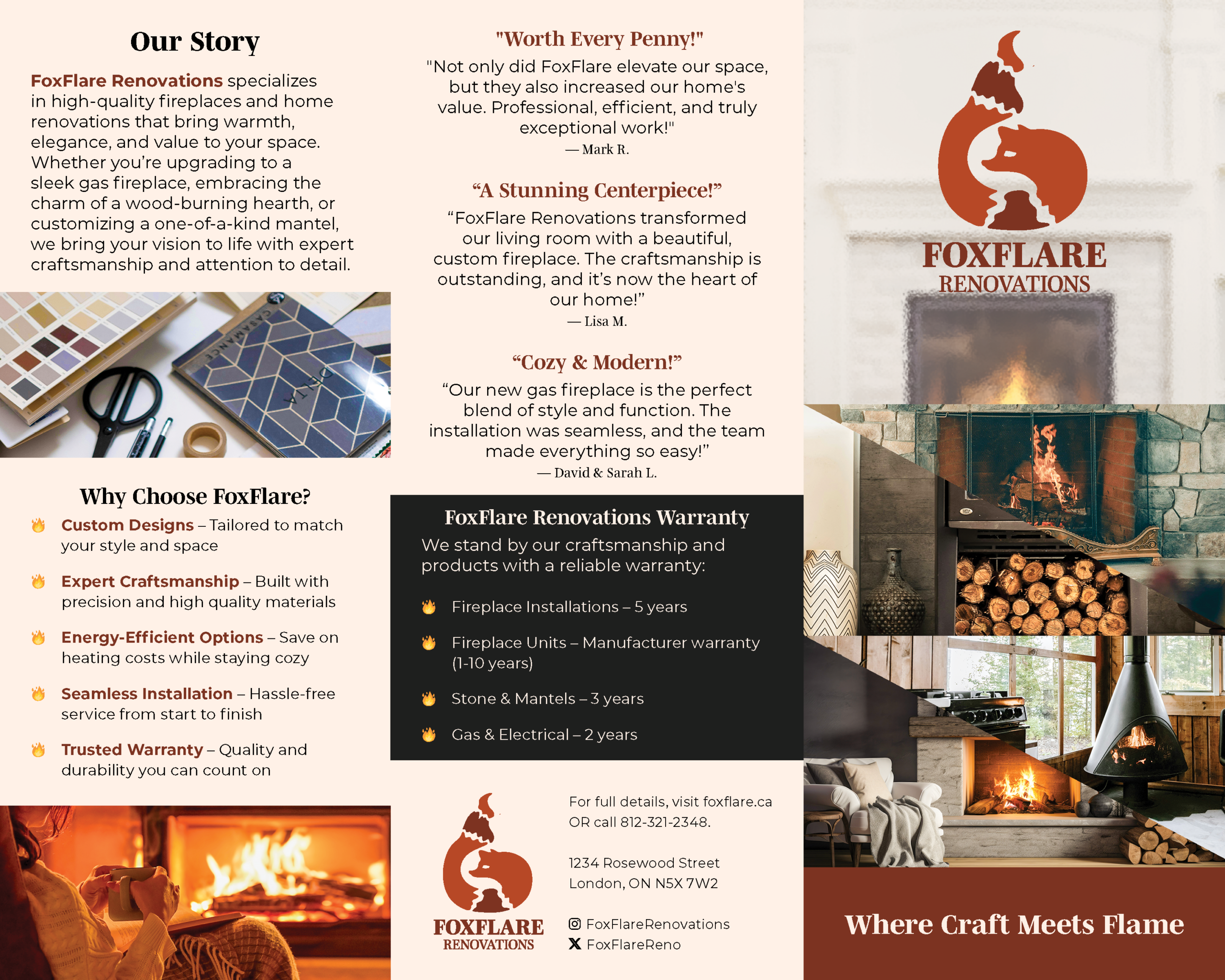
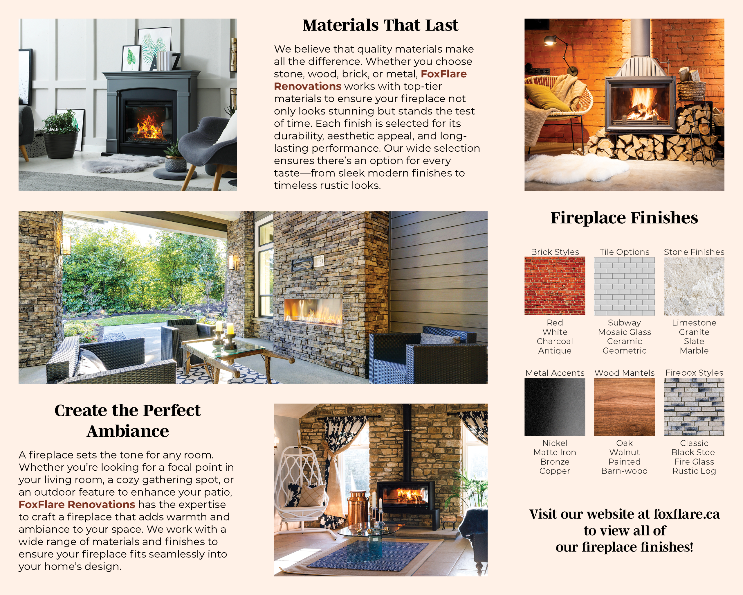
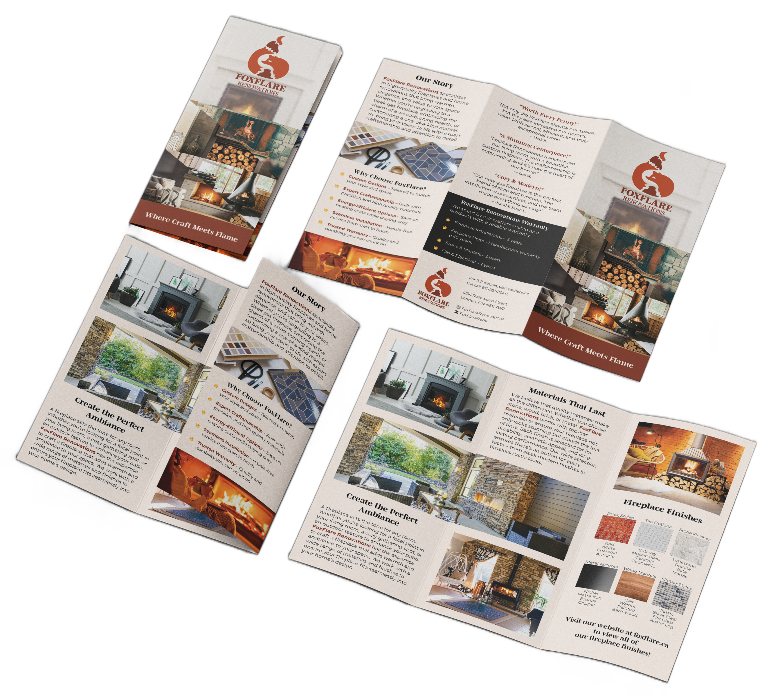
The project required designing a trifold brochure for FoxFlare, a home renovation company specializing in fireplace remodels. The objective was to create a sleek, modern, and professional brochure that showcases the company’s services, highlights custom designs and expert craftsmanship, and appeals to homeowners seeking highquality, long-lasting renovations.
Process
The process began by developing a warm, inviting colour palette of browns, creams, reds, and oranges to reflect both the natural warmth of fireplaces and the company’s approachable yet professional tone. The custom logo of a fox shaped like a flame served as a central brand element, reinforcing FoxFlare’s unique identity. Layout decisions focused on clear hierarchy and readability, balancing imagery of finished fireplaces with informative sections and customer testimonials. Modern serif typography was used for headings to convey sophistication, while body text remained clean and legible. Overall, the brochure combines strong visual appeal with informative content to guide readers through the brand story, demonstrate craftsmanship, and encourage potential clients to get in touch.
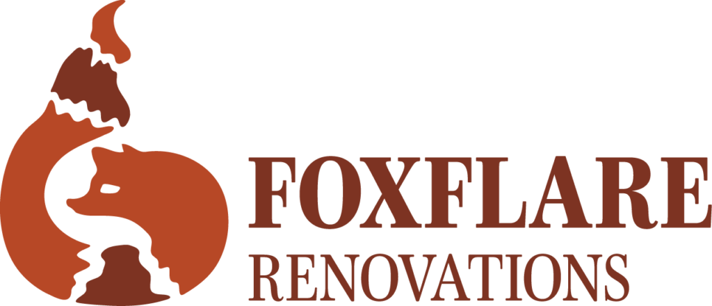
Logo
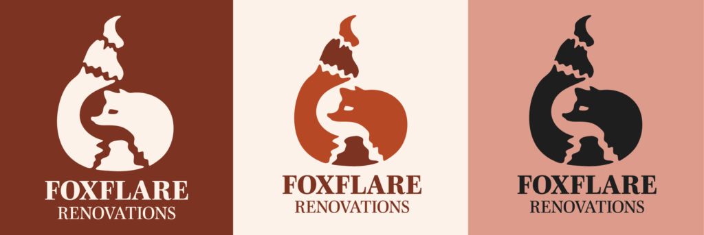
The logo features a fox shaped like a flame, combining clever symbolism with visual appeal. The fox conveys agility, intelligence, and character, while the flame shape ties directly to the core service: fireplaces. This dual imagery reinforces FoxFlare’s unique identity and creates a memorable, playful mark that stands out in both marketing materials and the brochure.
Colours
The palette of reds, salmon, creams, and other warm tones was chosen to evoke the natural warmth of fireplaces and the cozy, inviting feeling homeowners associate with their living spaces. These tones balance approachability with sophistication, helping the brochure feel both professional and welcoming. Warm colors also guide the eye through the layout and highlight key areas of content.
Char Hearth
CMYK: 32, 84, 91, 37
RGB: 125, 51, 33
HEX: #7D3321
Blazing Ember
CMYK: 20, 84, 100, 11
RGB: 183, 72, 38
HEX: #B74826
Salmon Flame
CMYK: 12, 44, 41, 0
RGB: 221, 155, 138
HEX: #DD9B8A
Cream Glow
CMYK: 0, 5, 7, 0
RGB: 253, 240, 230
HEX: #FDF0E6
Typography
Mencken Std
Mencken Std, a modern serif, was chosen for headings to convey sophistication and reliability. Its strong letterforms create hierarchy and visual interest, guiding the reader through sections while complementing the warmth and professionalism of the overall design. Cosmic Sizzle Sauce.
Typography
Montserrat
Montserrat, a clean sans-serif, was selected for body text to maximize readability. Its modern, geometric shapes balance the more decorative headings and maintain clarity across brochures, packaging, and other collateral. Together, the typefaces create contrast while keeping the brand approachable and visually cohesive. vibrant identity.