Objective
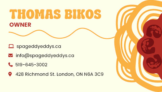
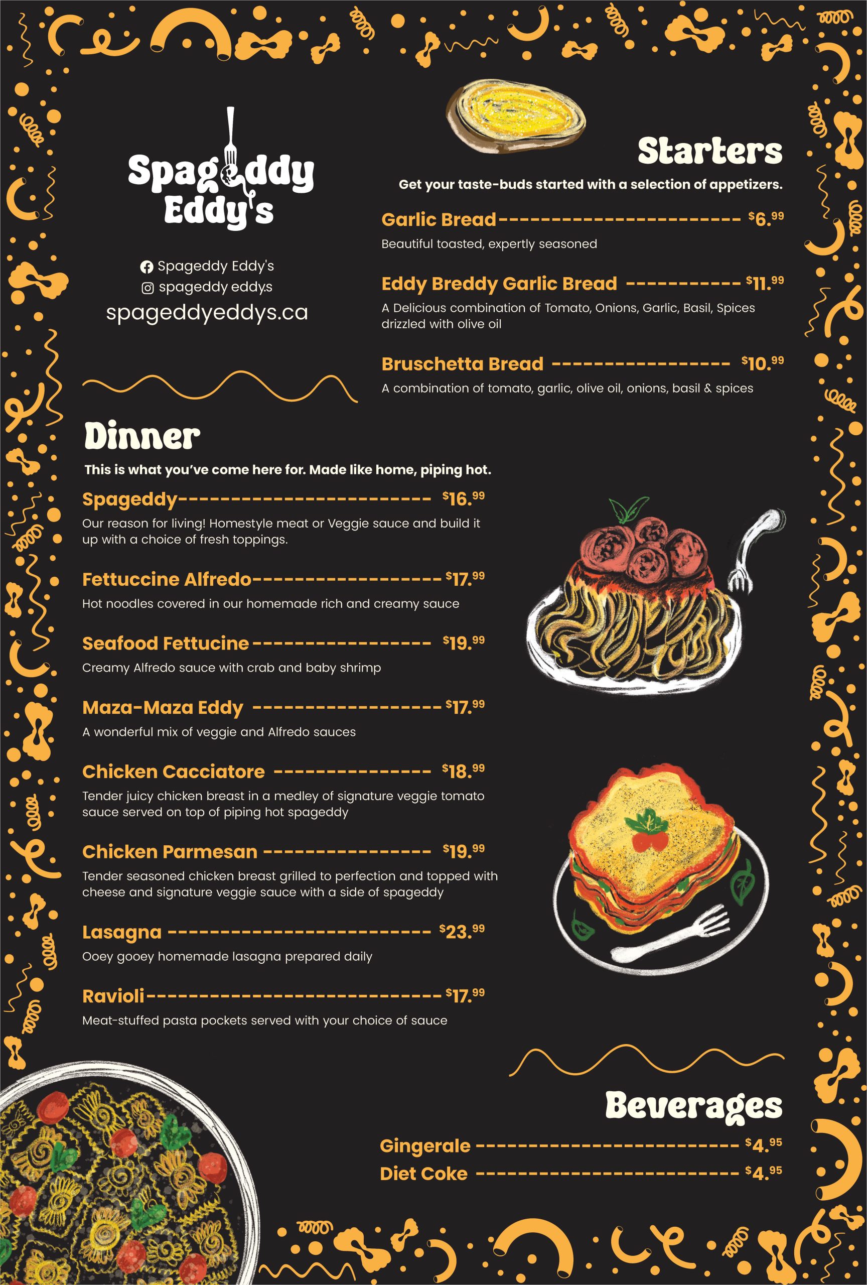
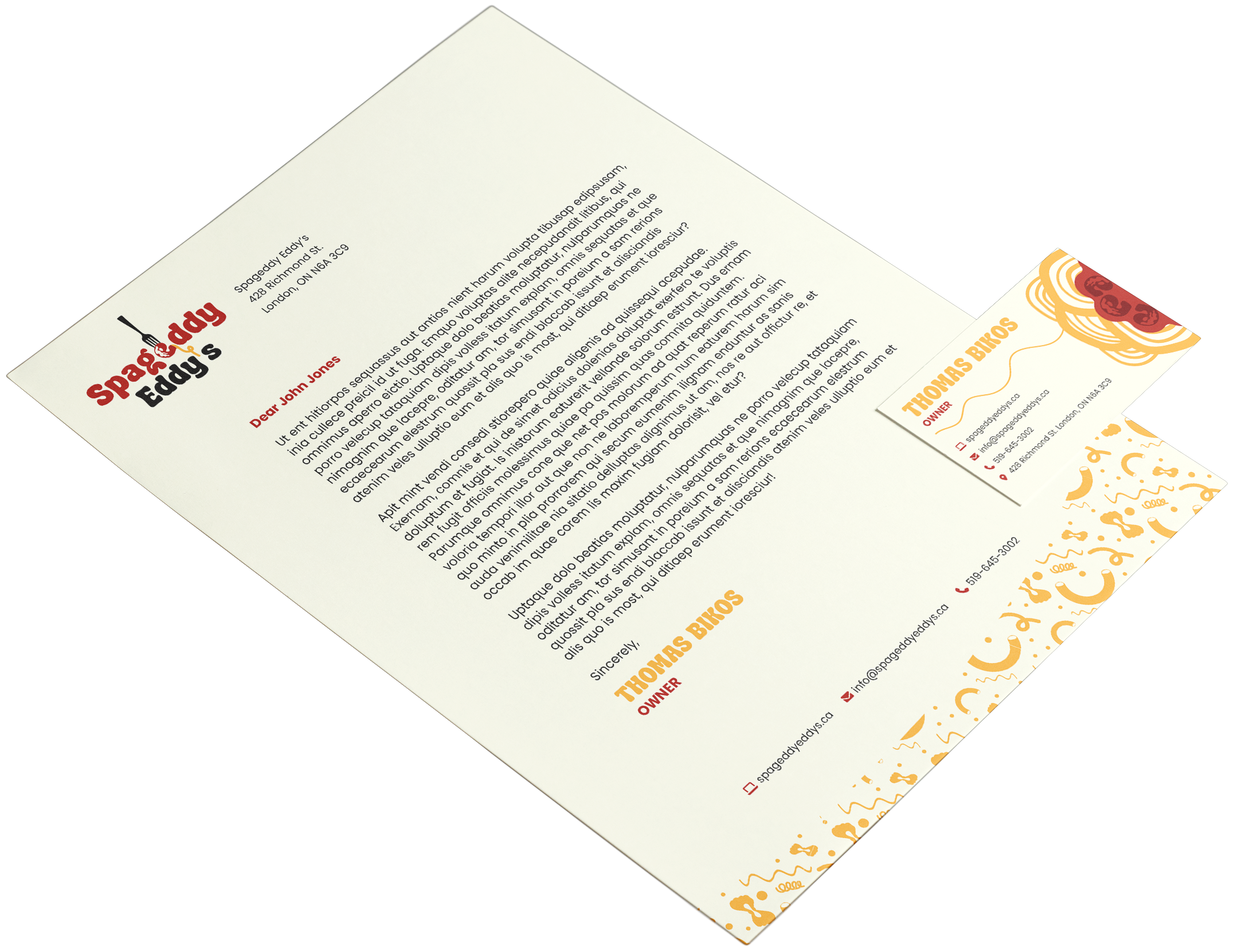
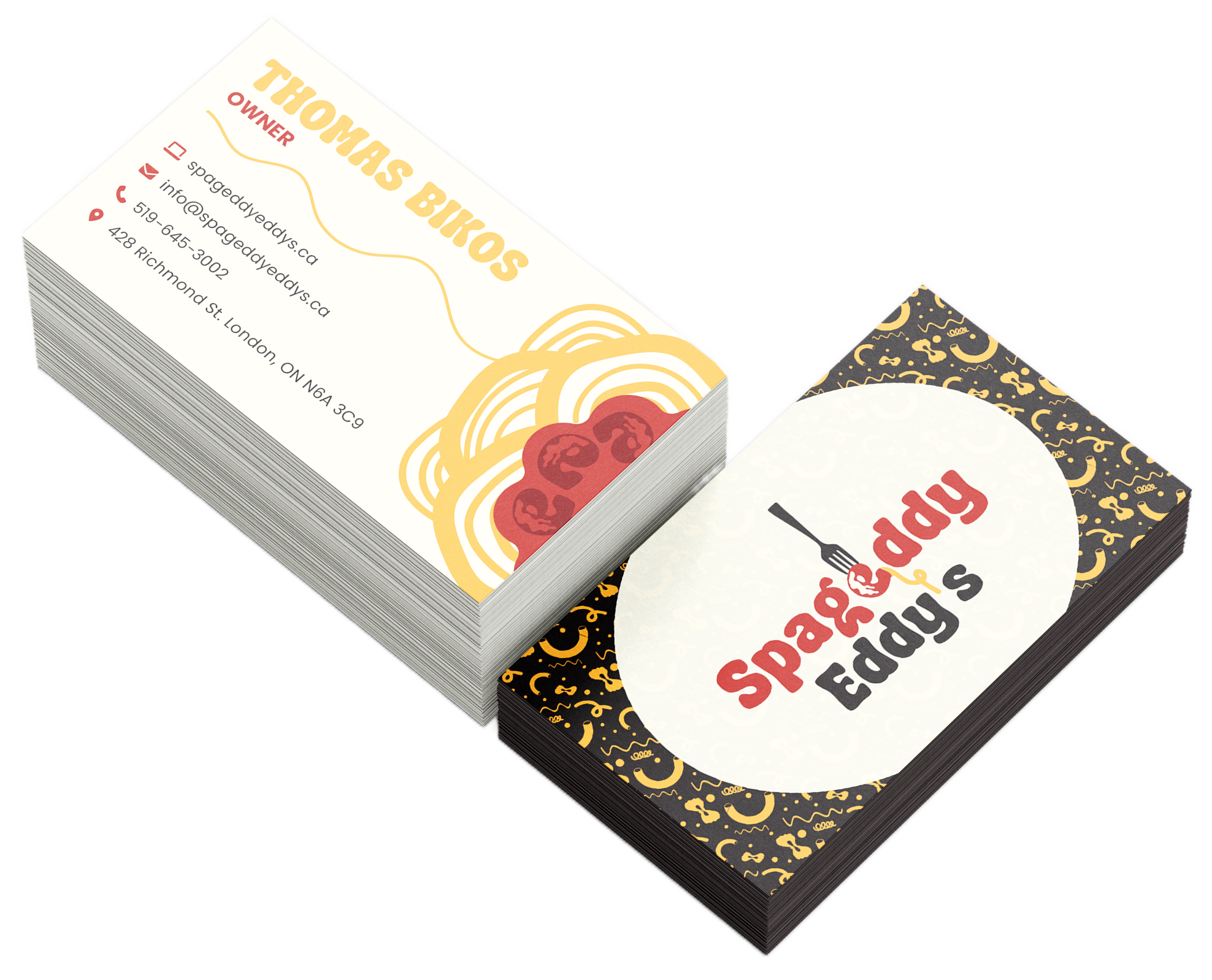
Spageddy Eddy’s required a refreshed brand identity to better reflect its personality as a downtown hidden-gem restaurant known for its nostalgic interior and approachable Italian comfort food. The goal was to create a fun, quirky, and memorable visual system that feels playful without becoming gimmicky, while appealing to young professionals, students, and locals. The new identity needed to translate seamlessly across branding elements, including corporate stationery and menu design.
Process
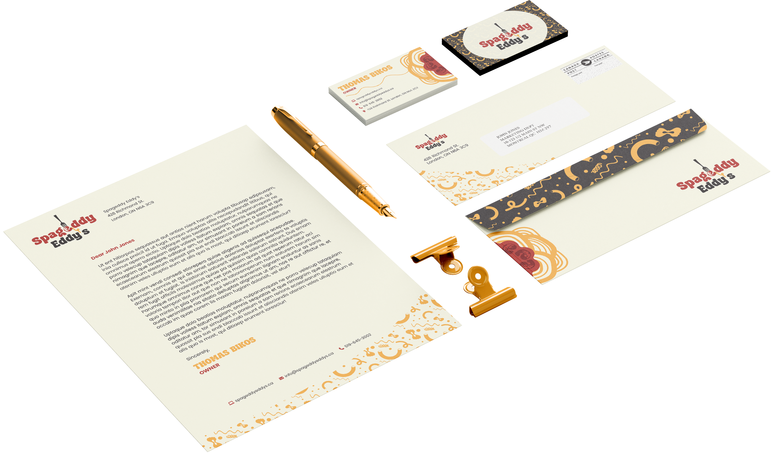
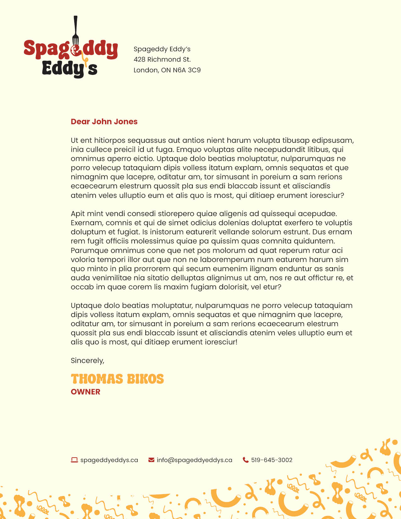
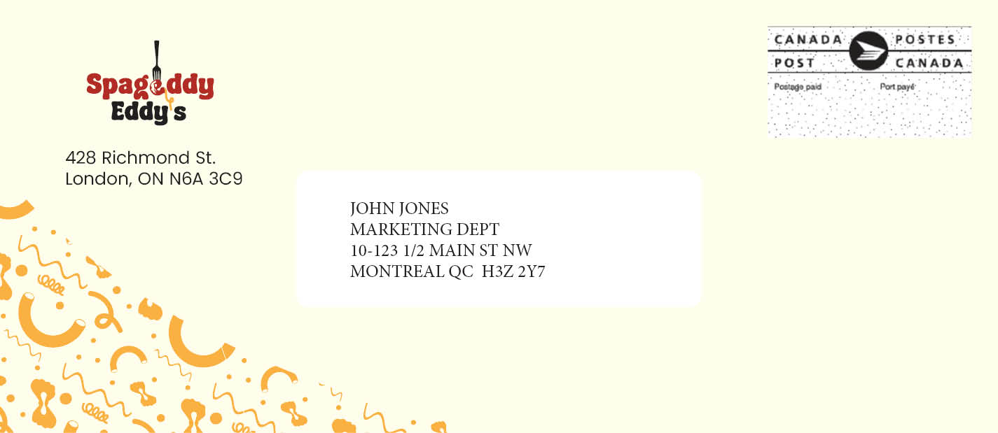
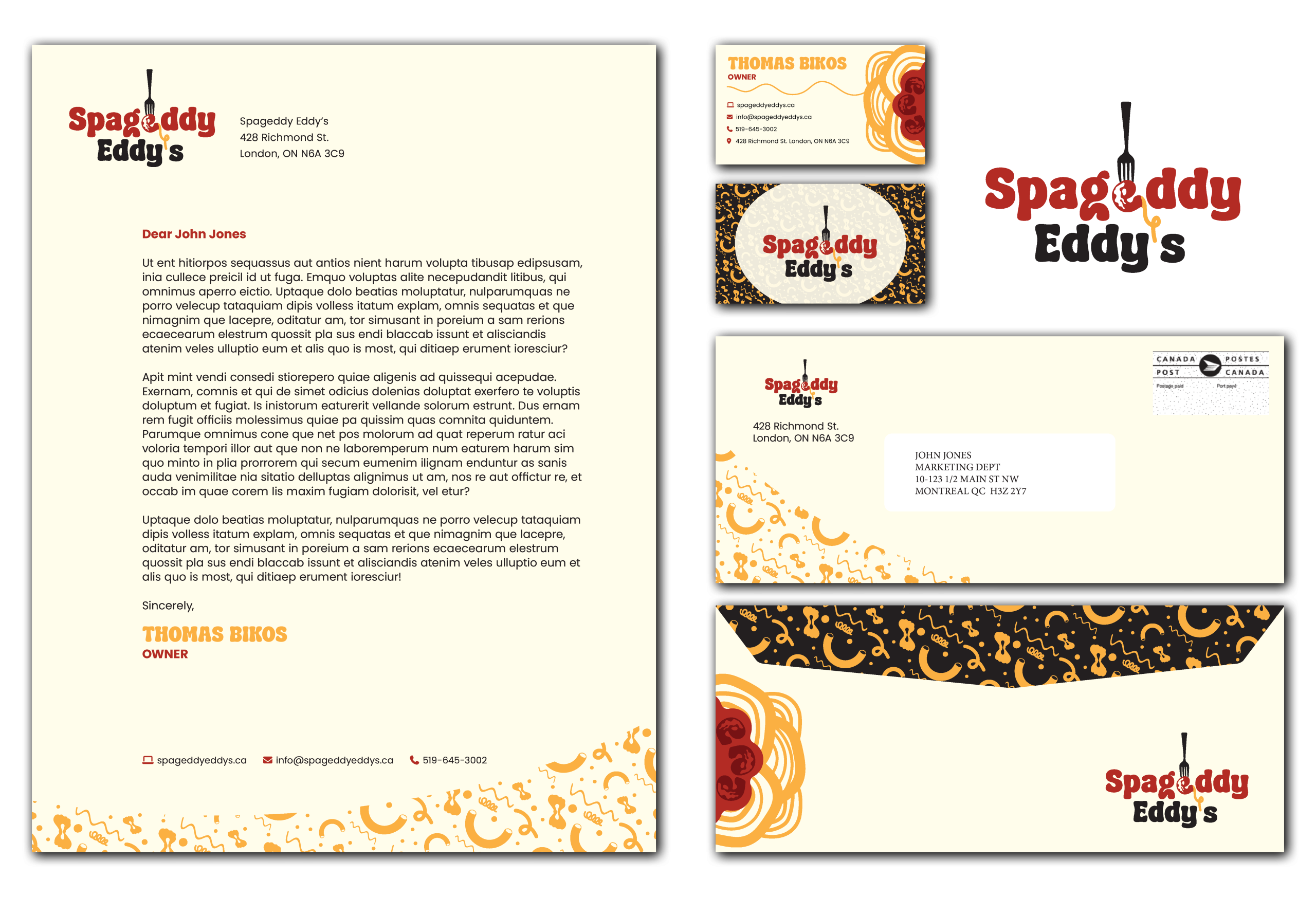
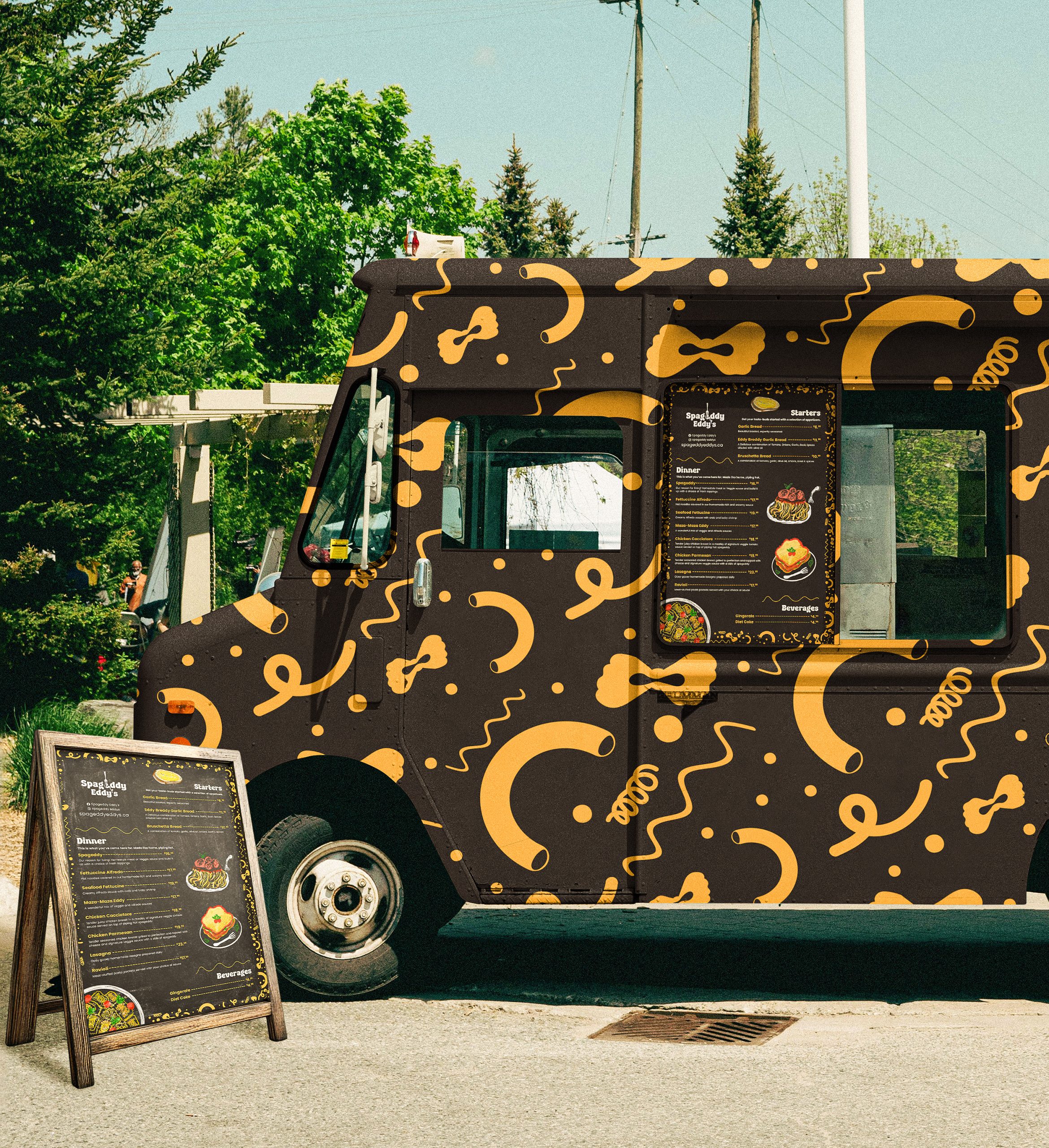
The brand was developed by defining Spageddy Eddy’s as playful, nostalgic, and welcoming, drawing inspiration from its antique-filled interior and comfort-focused menu. A bold custom logo, warm colour palette, and pasta-inspired graphic elements were created to balance personality with clarity. These visuals were applied across a cohesive stationery system and a functional, engaging menu layout, with careful attention to hierarchy, spacing, and real-world usability.
Logo
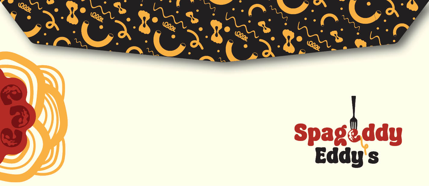
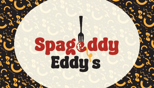
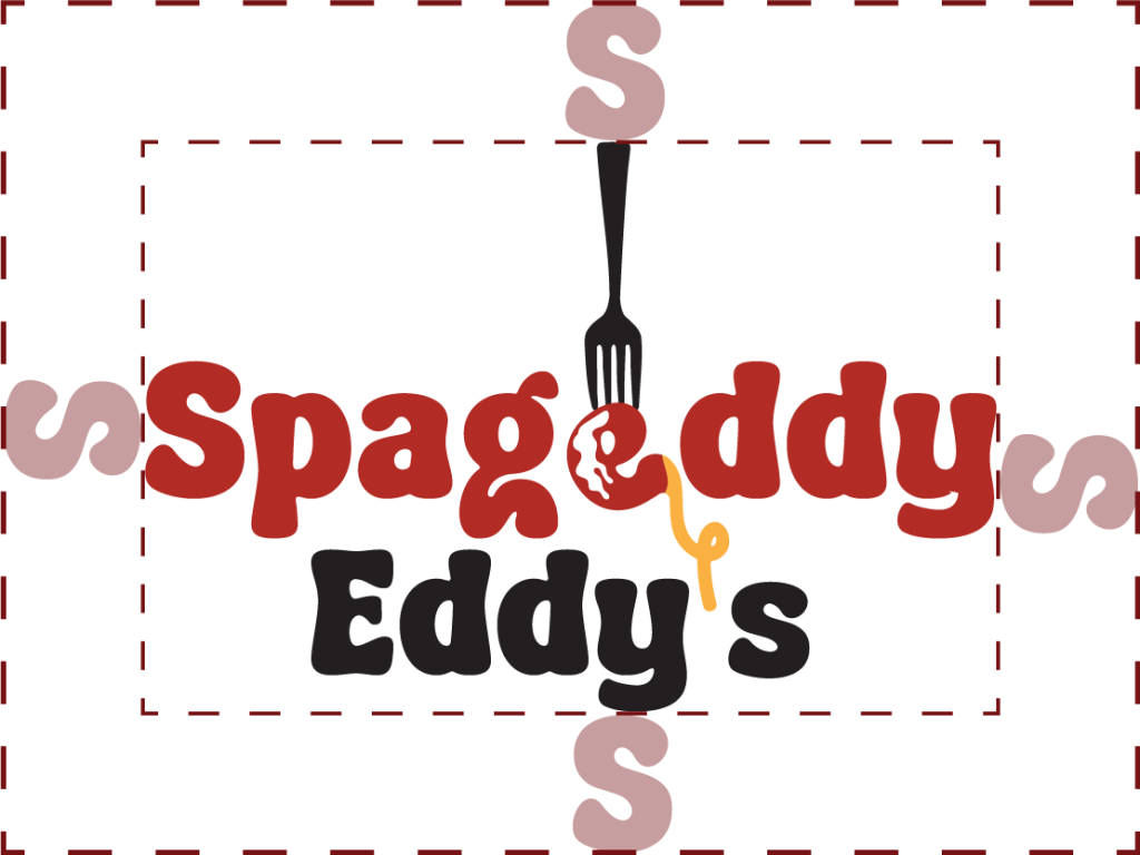
The Spageddy Eddy’s logo was designed to reflect both the playful spirit of the restaurant and its nostalgic, eclectic atmosphere. Using Retro Blendy, a retro-inspired typeface with custom modifications, the logo embraces an offbeat personality that feels fun, warm, and approachable.
A key feature is the meatball-shaped “E,” paired with a spaghetti-like apostrophe in “Eddy’s,” creating a visual connection to pasta while adding a distinctive and memorable brand element. These subtle graphic touches reinforce the restaurant’s identity in a lighthearted yet cohesive way.
The color palette of black, red, and yellow draws inspiration from classic pasta and sauce tones, keeping the brand visually appetizing and energetic. Simplified black-and-white variations were also developed to ensure flexibility across a range of applications and media.