Role: Designer | Year: 2024
Tools:
Adobe Illustrator
Adobe InDesign
Project Type:
Conceptual
About The Book Cover
This typographic book cover redesign for The Invisible Life of Addie LaRue by V.E. Schwab explores the themes of time, memory, and immortality through expressive typography and vintage-inspired textures.
Objective
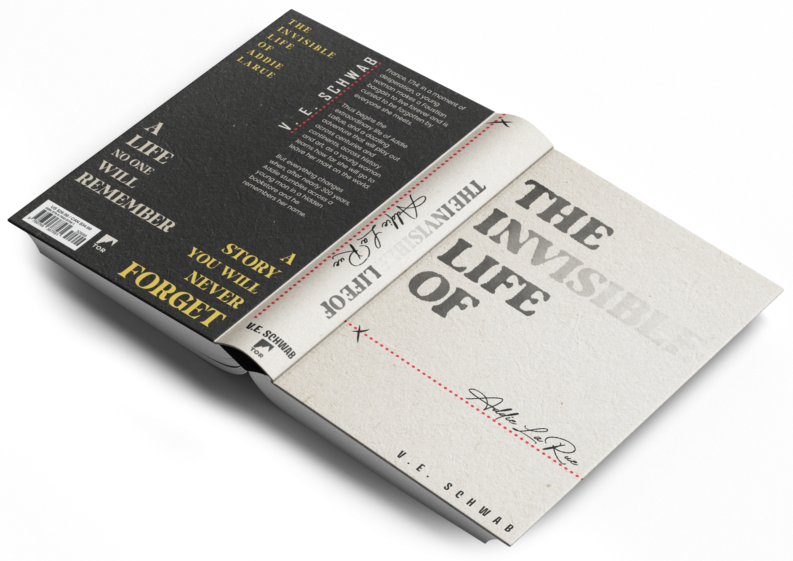
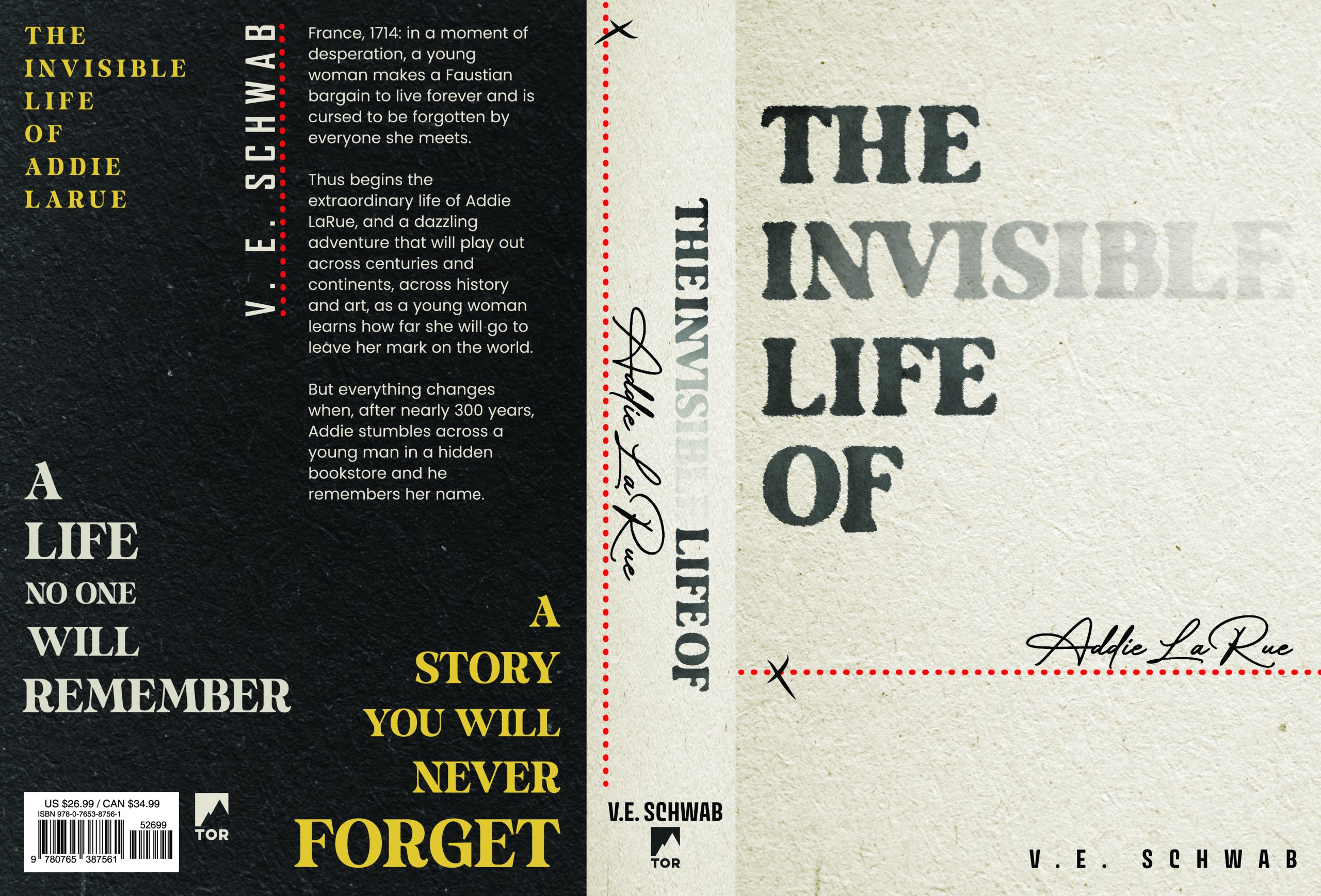
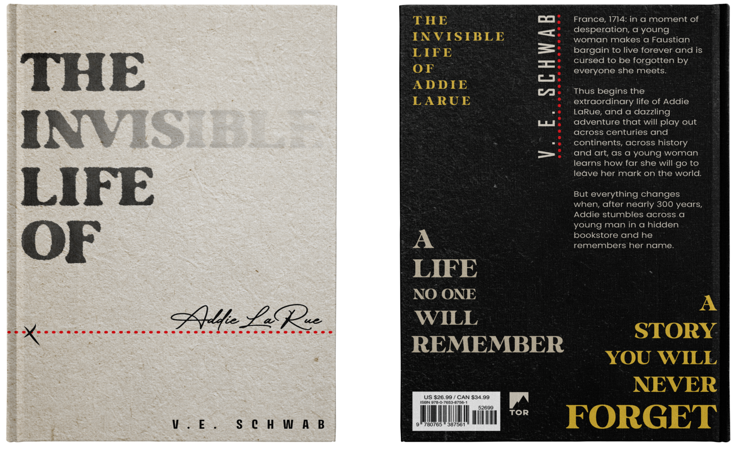
The objective of this project was to design a typographic-driven book cover that captures the novel’s themes of identity, memory, and impermanence without relying on illustration. The design aims to appeal to literary fiction readers by using type as the primary storytelling element, creating a cover that feels timeless, intimate, and emotionally restrained while still visually distinctive.
Process
The process focused on using typography to reflect Addie LaRue’s fading existence and lasting mark on the world. Ink-like letterforms and gradual transparency were used in the title to suggest disappearance and erosion over time. “Addie LaRue” was treated as a signature, paired with a red underline to symbolize the contract that defines her fate. A limited colour palette and paper-textured background were chosen to evoke age and tactility, while the back cover typography was arranged to remain clean and structured, allowing visual interest through hierarchy and colour rather than imagery
Typography
Brother Signature
A handwritten script used to treat “Addie LaRue” as a personal signature rather than standard text. Its fluid, natural strokes evoke intimacy and reinforce the idea of a contract bound by a human touch, referencing the pact central to the novel’s narrative.
Poppins
A clean geometric sans-serif used for the back cover body copy. Its simplicity and high readability create a calm, structured contrast to the expressive display typography, allowing content to remain clear and balanced.
Avory I PE Variable
A modern variable sans-serif used for the author’s name. Its flexible weight and wide spacing give it a refined, contemporary feel while adding visual interest and hierarchy without overpowering the composition.
Milk and Honey
A bold display serif used for the title and back cover headers. Its vintage-inspired character adds warmth and timelessness, supporting the themes of history, longevity, and emotional depth.